

Read Time
5 mins
Main Content Focus
Defining UI framework
Designing responsive HTML5 web game
My Roles
I worked together with the Head of Design and 2 other UX designers to find the best way to convert Flash games to HTML5. I was responsible for building Blotto Lotto, which was the first game to be built responsively, so there was a lot of trial and error and loads of fun.
The Task
The business requirement for this project was simply transforming a Flash game into an HTML5 web-based one. It seemed rather easy at first, but it turned out to be quite challenging. The main reasons are:
1.It was the first set of games to get converted, so we needed to find out how things should be built and come up with a framework that hundreds of other games could follow.
2.For designing a game for all mobile browsers, there were a lot of technical limitations, like interaction gesture restrictions, animation loading issues, and browser-specific UI requirements.
3.The brief was set at a time when responsive websites had just started to get noticed, and the concept of building a responsive web game was still completely rare. We had little to learn from, so the whole design process involved a lot of trial and error.
Defining the size of the canvas
The first thing we needed to define on the wireframe was the size of the canvas — it took us days to get the right dimensions. Here's the story: a lot of websites nowadays are built on the Bootstrap grid with well-defined canvas breakpoints. Yet the grid wasn't applicable to our games, as we couldn't push any part of the game UI below the browser's visible fold. We needed a grid system that was not only width-responsive but also height-responsive. In a nutshell, we had to tailor our own responsive grid.
To start with, the product owner and I identified the main pain points users had and some major bugs that needed fixing. Quickly fixing those issues first not only gave us an instant improvement in overall user experience, but also bought us time to draw up a proper vision for where the product should be heading. We documented the urgent issues and jointly presented them to the board, since we needed the business’s consensus. For a quarter, we focused on dealing with those niggling issues.
Breakpoints and canvas dimensions
Finding the breakpoints was like detective work. I looked at the most-used devices among our users. In theory, if our games fit the smallest screen size of popular phones, they should work for larger phones too, and the same applies to tablet and desktop. But I was surprised there was no standard documentation on device resolutions — the resolutions available online weren't the viewport resolutions, meaning I had to find them out myself.
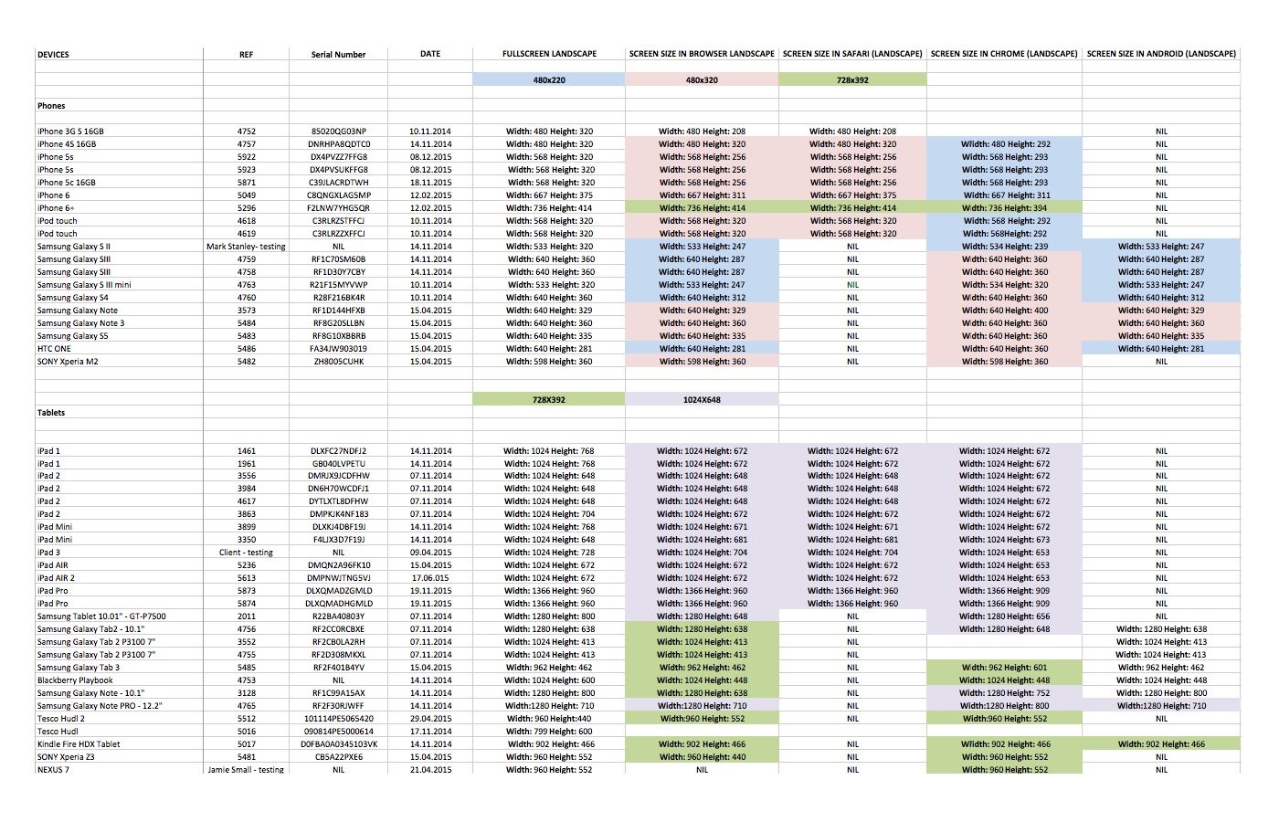
High graphic quality is essential to the game experience. Together with the Head of Design, we gathered the most common devices and tested the graphics on them to make sure everything was pixel-perfect.
Building Blocks or Liquid
Since we had the canvas, we could then define how the UI should behave within it. There were two main routes we could go for:
1.Building the game at a minimal size, and showing more of the graphic background on larger screens
2.To have liquid layouts, so all elements scale and reposition based on the available screen size.
And we challenged ourselves to build the latter. It was a rather radical idea to build responsive games back then, but somehow we made it happen. Although later on we fine-tuned a better way for how the grid should scale, we're still proud to have set up the foundation for future versions to ride on.
What I learnt
1.It might sound a little bit weird, but I love defining things. (There was a time when I was too drunk and was attempting to redefine time and space.) It's a great pleasure to find evidence and then set up rules to fix a problem.
2.The first version of a new design approach can never be perfect; all we can do is let go of the perfectionist mindset and try to make the best version possible at the time. It then paves the way for future versions to improve.